

I recently asked for feedback on three potential covers for my upcoming book "Use A.I. Stay Human." I received 57 responses in 24 hours. I used AI to collate and analyse the data, highlighting key insights and contradictions in the feedback. This post is Part 1, where I outline the cover options, feedback, and show the analysis.
Table of Contents
Here are the cover options:
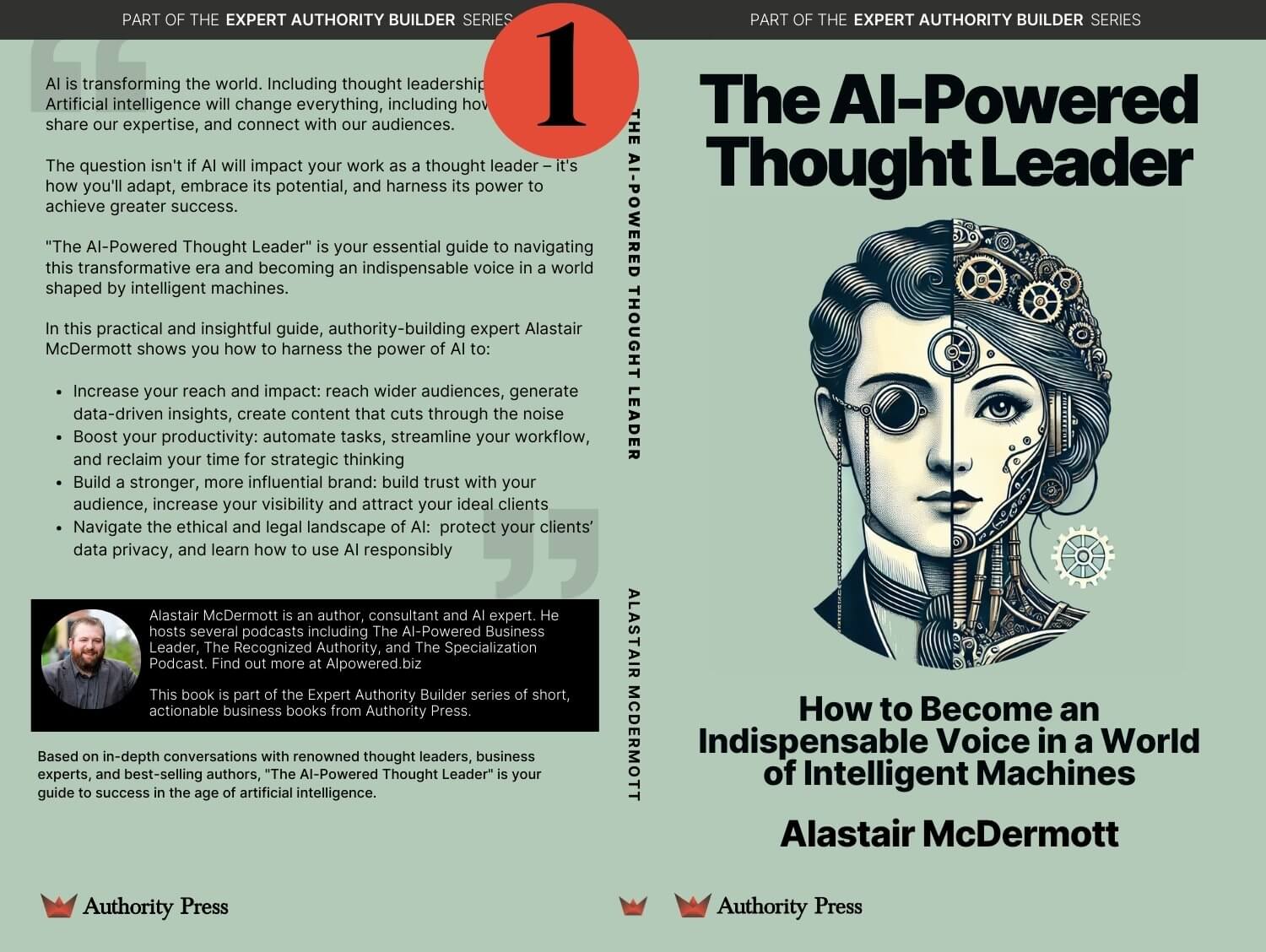
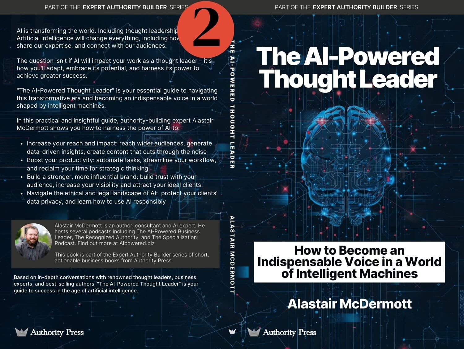
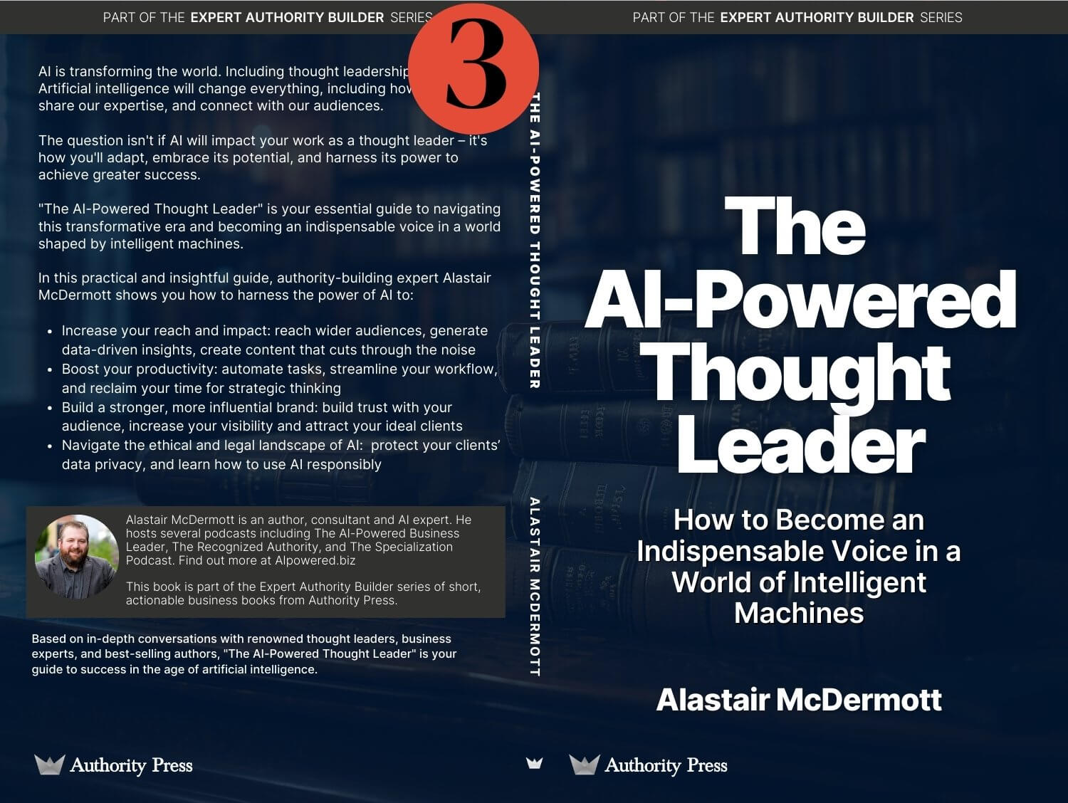
If you want to share your opinion on these, please leave a comment on this LinkedIn post.
How I Analysed It
I used ChatGPT and Claude to process and analyse the feedback. This not only demonstrated AI in action, but also saved time.
Quantitative Results
Here's the voting breakdown:
- Cover 1: 30 votes (52.6%)
- Cover 2: 9 votes (15.8%)
- Cover 3: 16 votes (28.1%)
- Undecided: 2 votes (3.5%)
Winner: Cover 1 was the clear favourite, getting over half the votes.
Qualitative Analysis
Cover 1: The Front Runner
Strengths:
- Unique and eye-catching design
- Good blend of human and machine elements
- Distinctive colour scheme
Criticisms:
- Some saw it as "steampunk" or "dystopic"
- Colour wasn't seen as authoritative
- Concerns about clutter and gender representation
Contrasting Opinions
One respondent praised its uniqueness: "The green. It's different. Feels art deco bioshock instead of what everyone else is doing."
Another criticised: "Don't like No 1 - too much detail and too gray color."
Cover 2: The Least Favoured Option
Strengths:
- Modern and high-tech look
- Clear AI representation
Criticisms:
- Seen as generic or stock imagery
- Looked overly technical
- Distracting design elements, especially the white banner
Notable Feedback: One respondent thought the brain imagery suggested "brain implant," which could be misinterpreted.
Cover 3: The Minimalist Approach
Strengths:
- Clean, professional look
- Emphasises the instructional nature of the book
Criticisms:
- Lacks visual interest
- Might blend in with other books
Contrasting Opinions: Some praised its simplicity and authoritative look, while others found it bland. One respondent called Cover 3 a "yawn," saying it "doesn't tell me anything you're making me do all the work."
Key Insights and Implications
- Colour Psychology: The green of Cover 1 sparked debate. Some liked its uniqueness, others questioned if it suited the subject.
- Design Elements and Misinterpretation: Feedback on Cover 2's brain imagery suggested "brain implants," showing the risk of misinterpretation.
- Balancing Uniqueness and Professionalism: Reactions to Cover 1 and Cover 3 show the challenge of creating a design that's both eye-catching and professional. There might be a trade-off between standing out and looking serious and authoritative.
- Market Differentiation: Several respondents noted Covers 2 and 3 looked similar to existing AI book designs.
- Audience Segmentation: The varied responses suggest different preferences among audience segments. Further analysis could reveal if these preferences correlate with professional background, age, or other factors.
Next Steps
While Cover 1 was the favourite, the qualitative feedback is mixed. The strong but divided opinions suggest Cover 1 could stand out in the market but might also alienate some of the target audience.
Here's what I'll do next:
- Consider variations of Cover 1 to address concerns about colour and clarity.
- Try to combine the professionalism of Cover 3 with a more visually striking design.
- Conduct a second round of feedback with a smaller focus group, presenting refined designs.
I'll follow-up with Part 2 on how I actually did the analysis with ChatGPT and Claude.
The cover question that started this is in help me choose my book cover. The prompting side of analysis work is in how to get better results from AI.